
What’s in a Look? My First Brand Identity

While studying to be a designer, one of the most important projects I had was creating my own brand identity. How did I want to present myself to the world? More than just a logo, I had to learn the major components of a business system and create a comprehensive style I could use.
The Logo
Finding a Design
The most notable part of a brand identity is, of course, the logo. This is the iconic symbol that represents your whole look and from which all other branding stems from. To come up with mine, I started by sketching out a variety of ideas, all based on my name or initials with different visual elements. Then I picked the best ones and created cleaner versions of them using Illustrator.
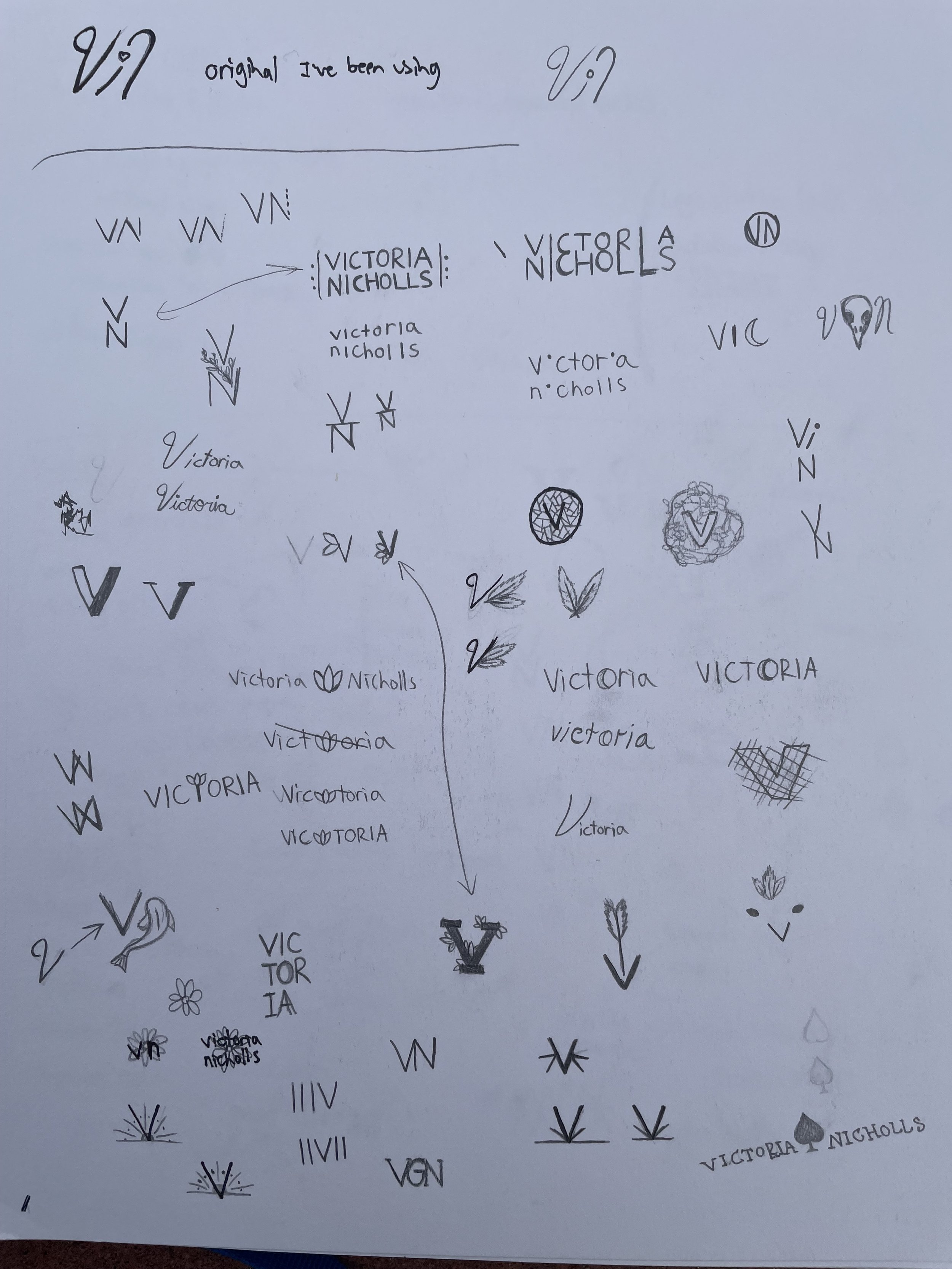
Logo Sketches
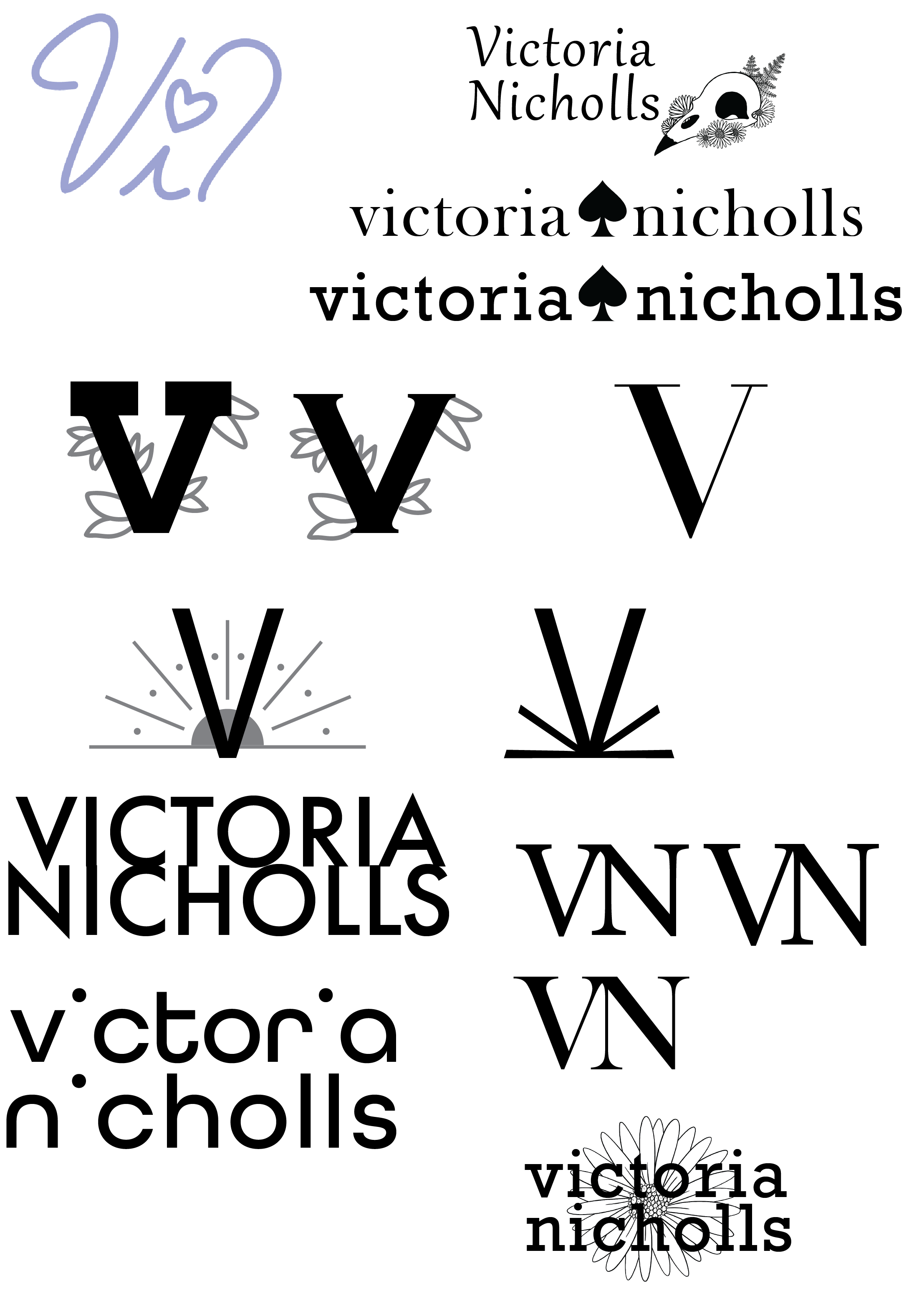
Illustrator Versions
I took these more finalized versions to logo critique, and the one that stood out as a solid design was the bottom left: my name, lowercase, in All Round Gothic with the bases of the i’s missing. The only change suggested was to just use my first name as the focus.
Colors, Typefaces, Wordmarks, Oh My
With the foundation of my logo selected, I next had to figure out the colors. I decided to do a gradient and tested a few different options. I landed on a purple to greenish fade (#76418F to #83C6BE).
Next, while the logo uses the All Round Gothic typeface, I needed one for body copy as well. I considered Sans Serifs like Futura, but eventually chose Poppins.
Finally, I had a good logo now, but I needed a smaller symbol that I could use in places where the full thing wouldn’t fit, such as a browser tab. Since my logo was my name, I decided a text based symbol called a “wordmark” would be best. I tried a few variations, but in the end, I did a purple “v” with a green dot in the space above it.
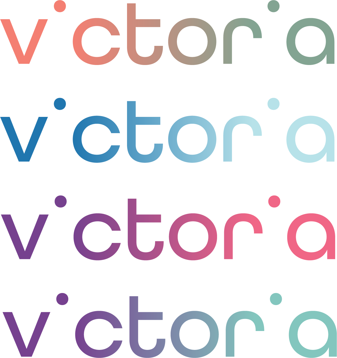
Logo Gradient Tests
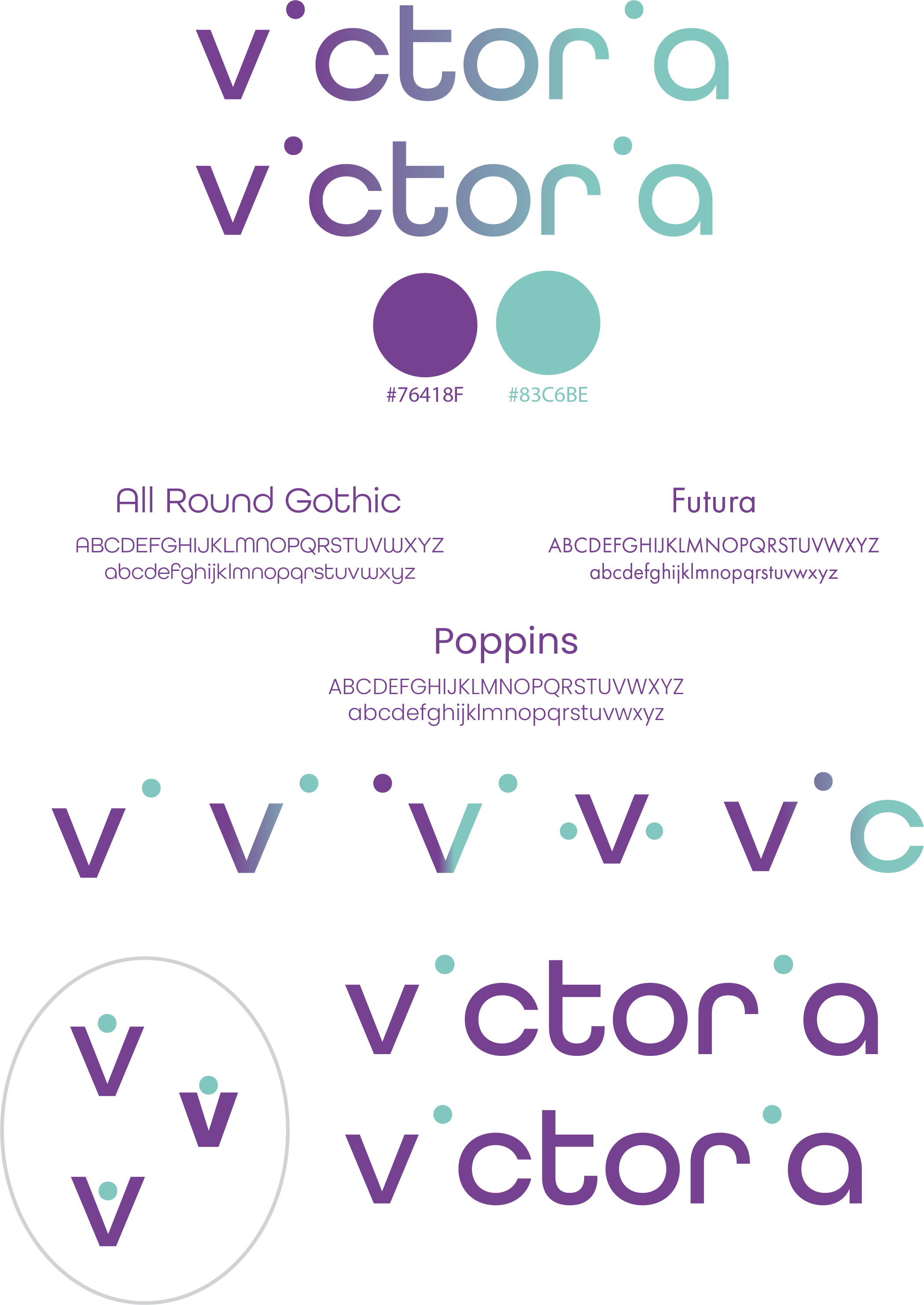
Brand board showing logo, color + typeface choices and wordmark variations

Final wordmark design
Business System Materials
With the logo and wordmark created, it was time to apply their elements to other documents in the business system. This included things like business cards and letterheads. Besides the color gradient, the solitary tittles of the i’s inspired me to use a polka dot motif as well.
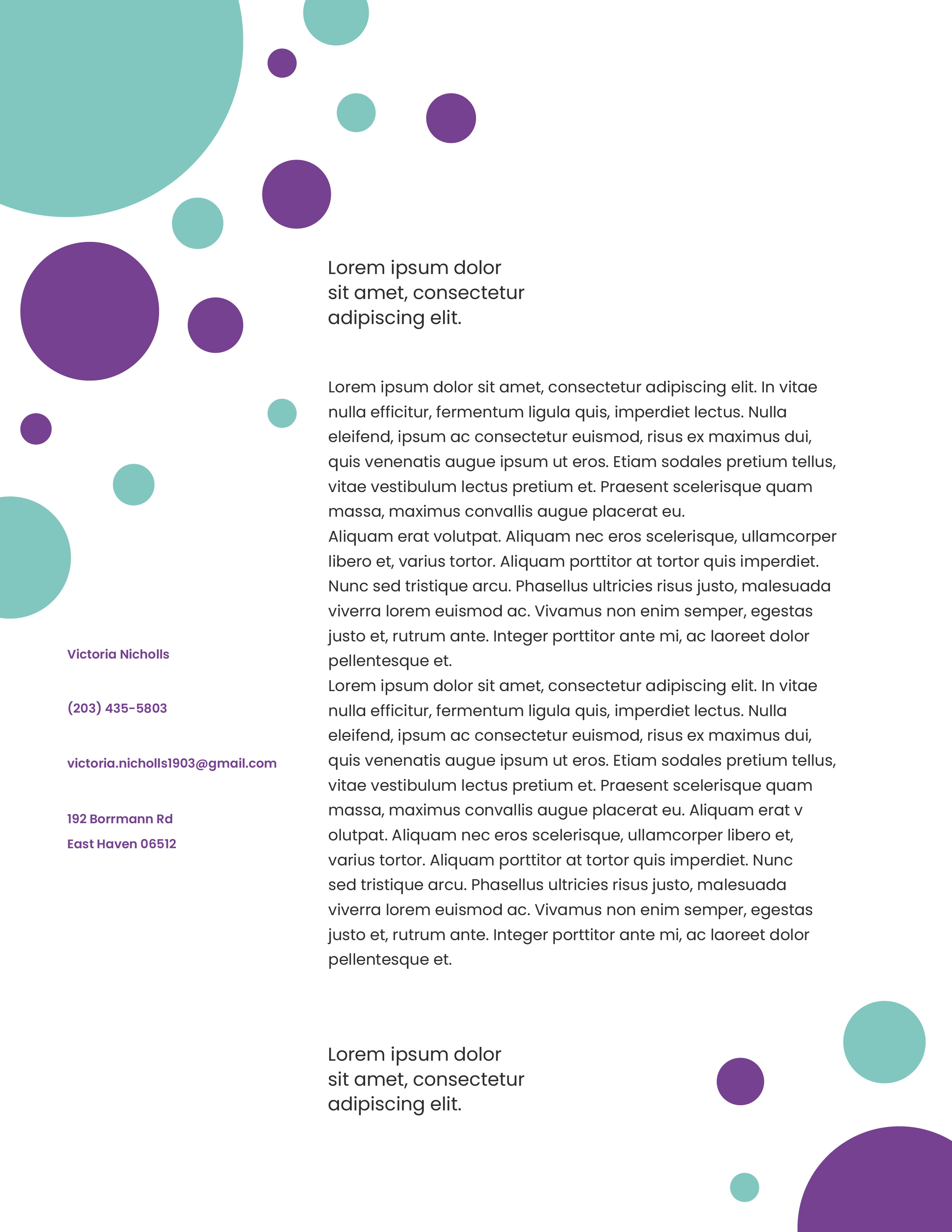
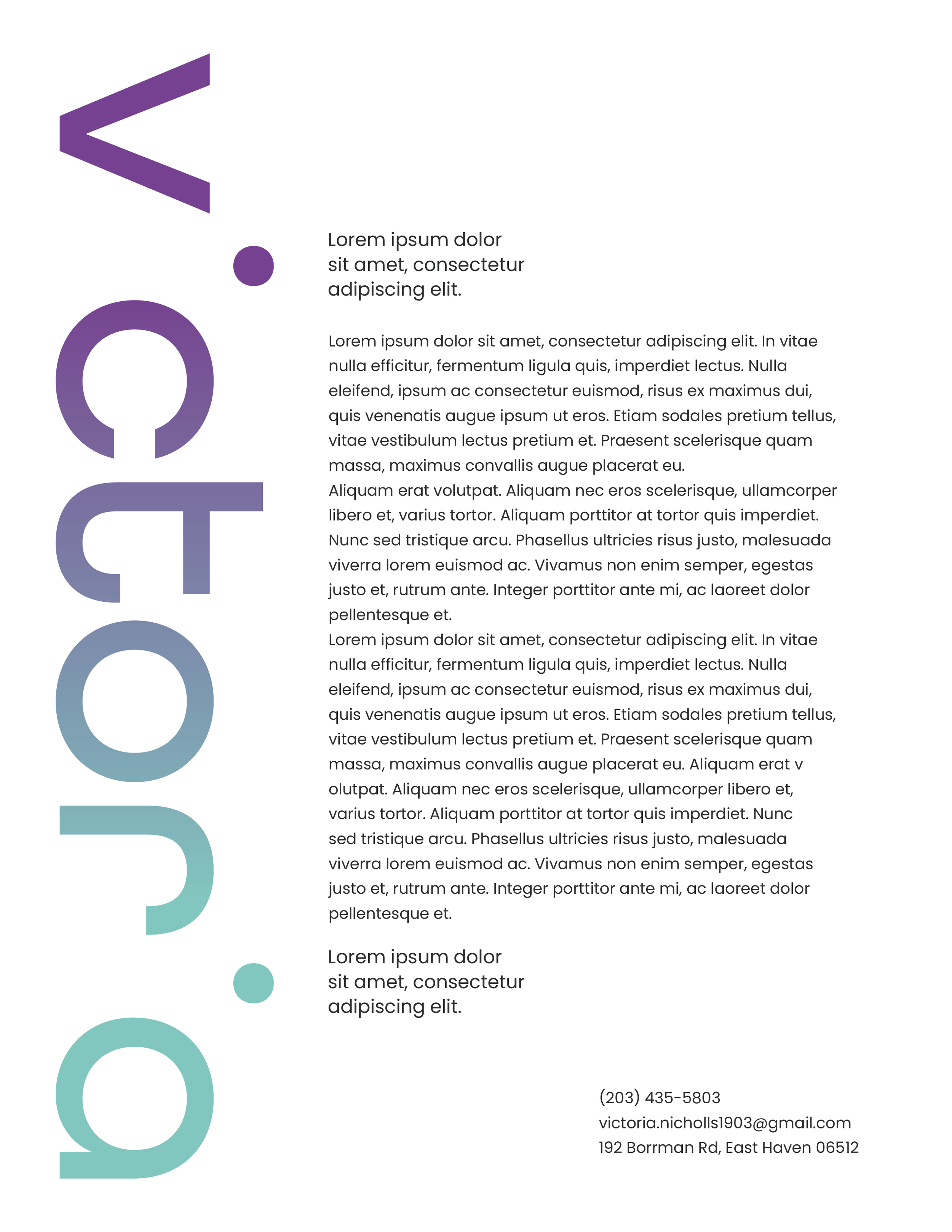
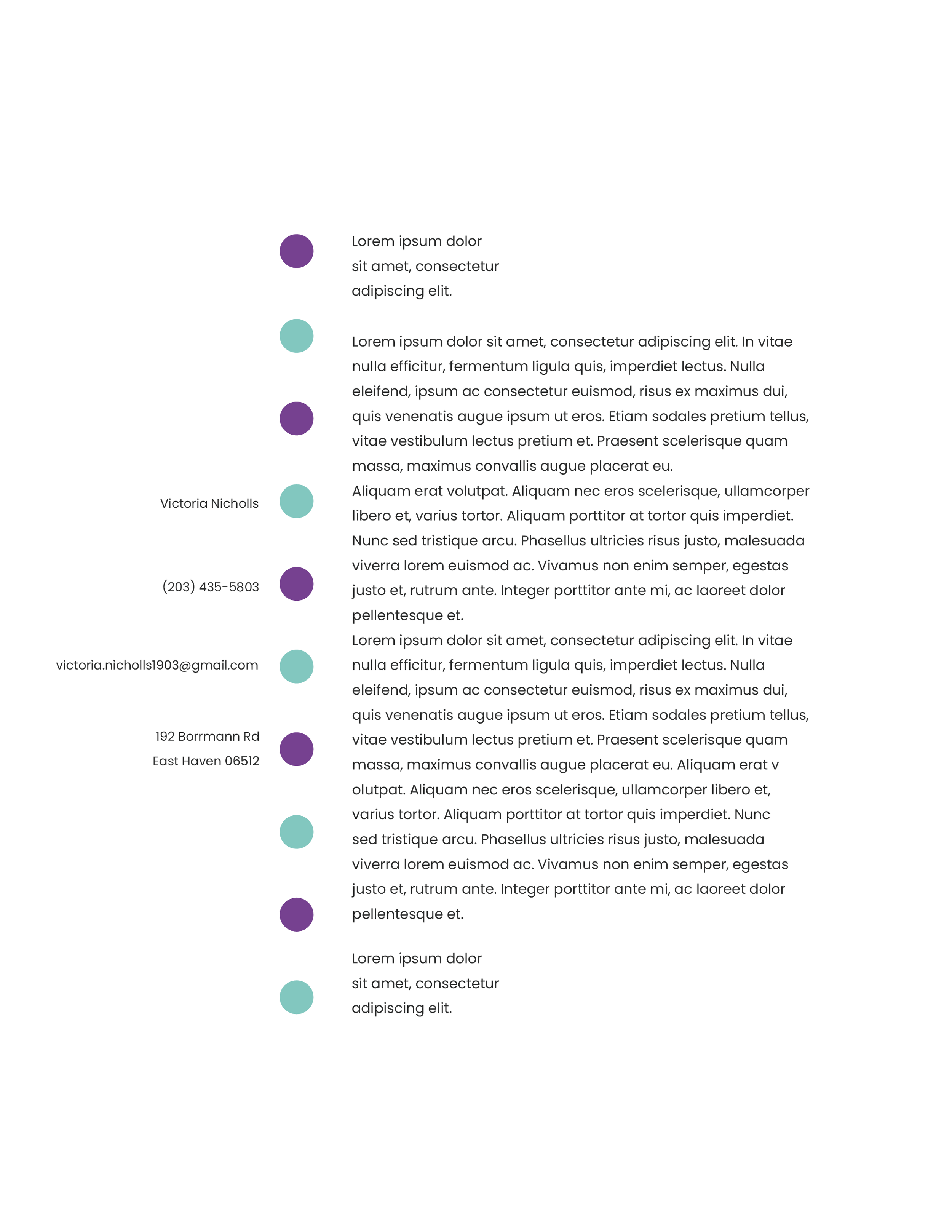
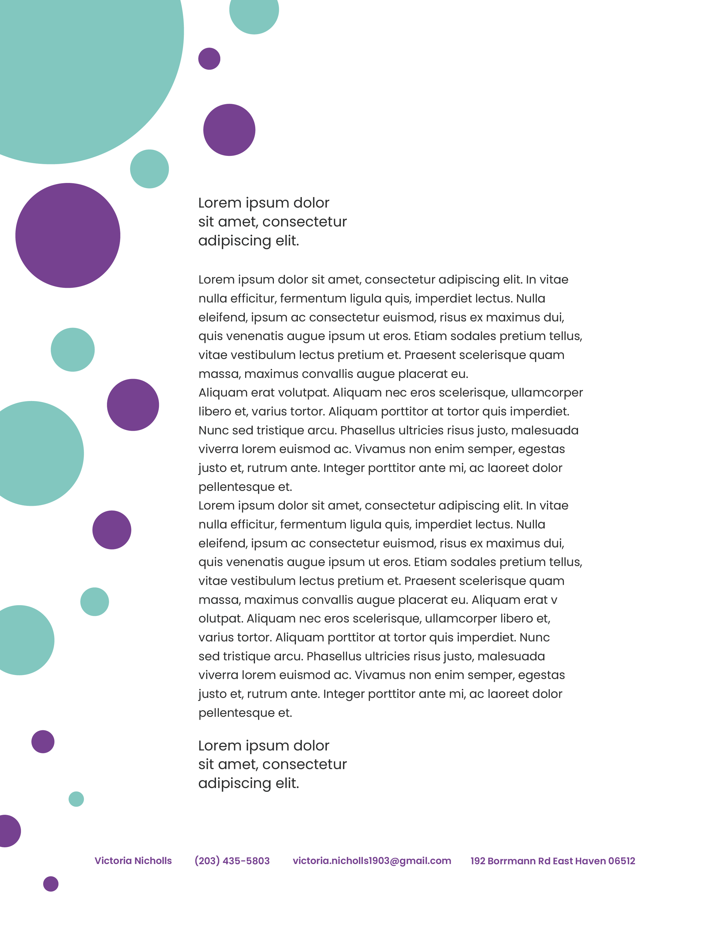
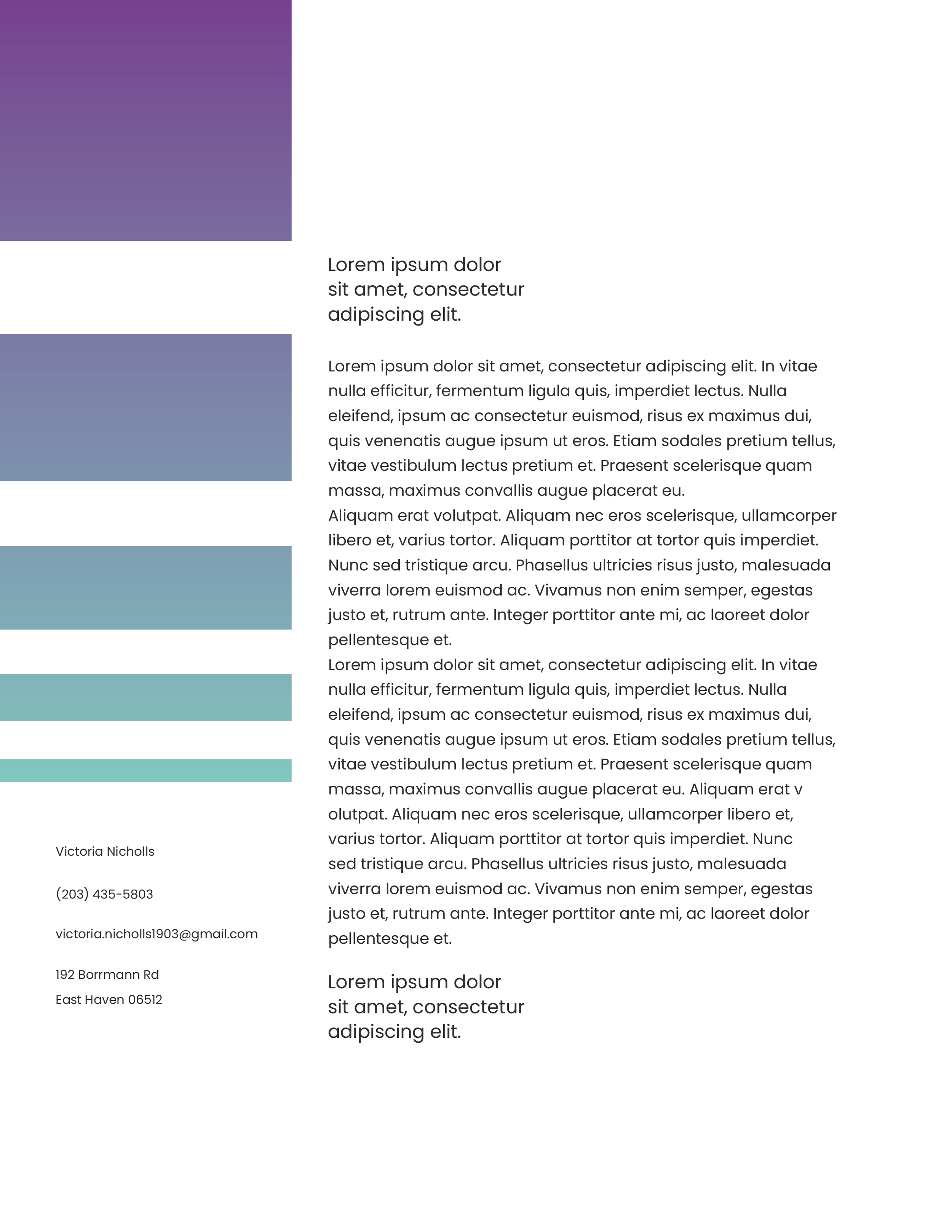
Letterhead Designs
When designing letterheads, the most important part of the document is the body copy of the letter itself. Second to that is the contact information. Therefore, branding elements must accentuate and guide readers along the content without being disruptive.
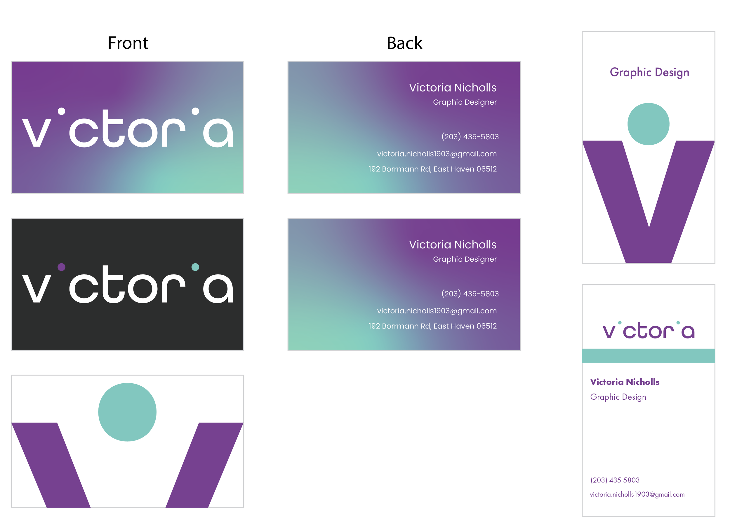
Business Card Designs
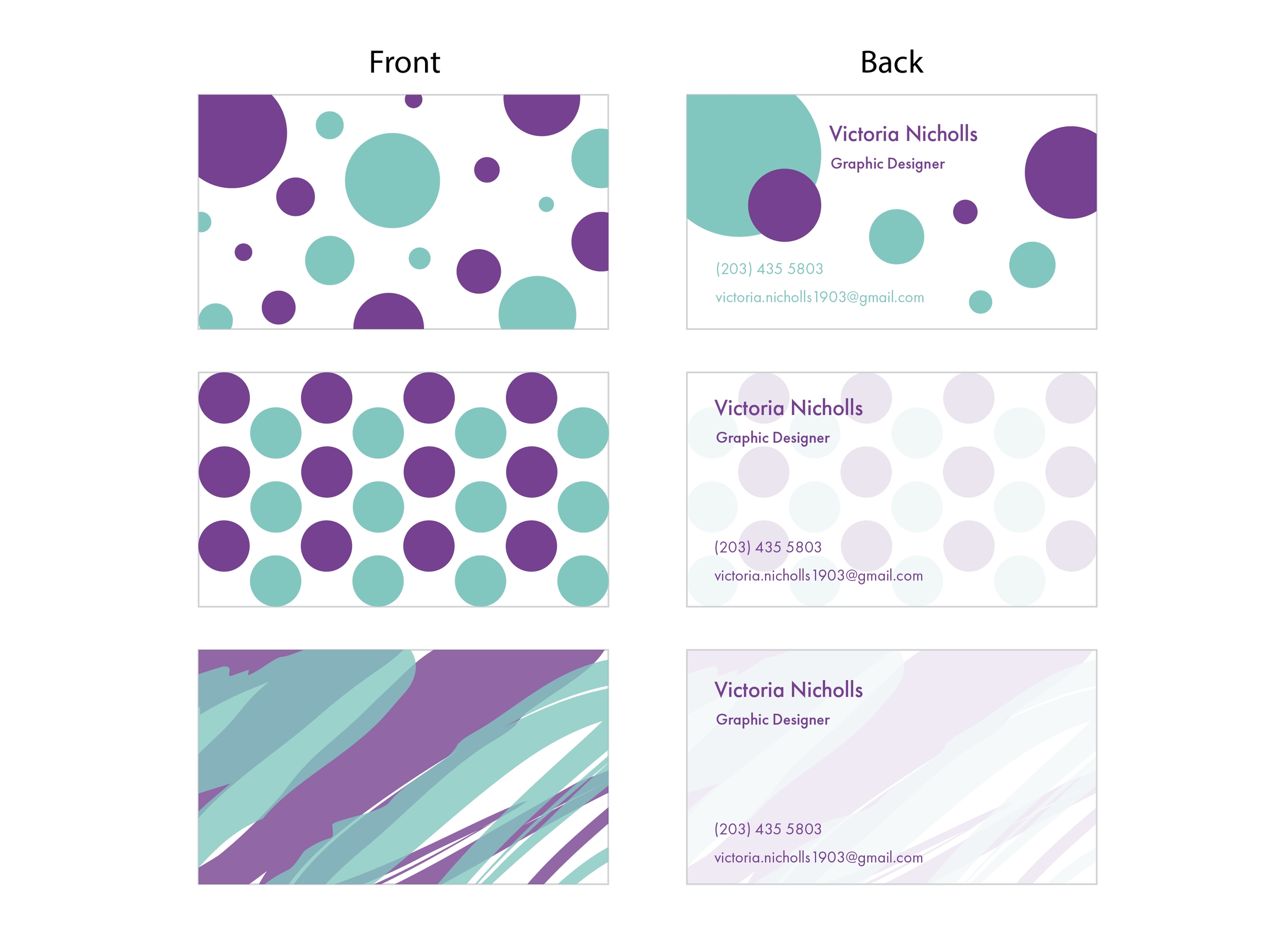
Business cards have two sides: the front with the main design or logo, and the back with contact information. Basically, one side captures attention while the other tells people where they can find more if they are interested.
On my first set of business card designs, I used my logos on the front. I also tried to make both sides feel connected. For example, the first card has a gradient and the back has what the gradient would look like when it is flipped. Similarly, the two dots on the second card line up with where the colors would be on the back.
The second set of cards uses visual patterns rather than the logo. As mentioned earlier, I had a polka dot motif, so the first one has dots of varying sizes scattered across it. The second one, on the other hand, places the dots in a very organized pattern instead. The back has the flipped version which is faded to allow for legibility. The third card attempts something different by having a watercolor effect with the same faded appearance on the back.
Logo Stinger
While studying motion graphics, I created a logo stinger using my logo. I incorporated squash and stretch principles, and you can read more about it in this blog post.

Animated Logo Stinger
Moving Forward
I was proud of this logo I created and the brand identity I built. However, while I enjoyed using it for a while, it is important to always be moving forward and redesigning with fresh ideas. I was given another branding project which pushed me to come up with something new. I took inspiration from one of the other logo designs I created here, the one with the small leaves/petals emerging from the letter V, in order to create the identity that now embellishes this website.
While I was reluctant to part with my logo and appearance at first, I realized during designing that I enjoyed the new look as well. I also found that I created a better and more thorough business system this time around.
Who knows if I might reinvent my look again in the future. As the world keeps moving, we must keep moving also and always find new ideas and styles to explore.