
UX Research Analysis: Hagaman Memorial Library


Background
The website for Hagaman Memorial Library in East Haven, Connecticut was evaluated and put under user testing. These tests were performed with a mix of remote and in-person participants. The goal of these studies was to observe how well users are able to navigate and find information and what obstacles they encounter. These observations were used to create suggestions for potential improvements.
The Website
Hagaman Memorial Library’s website can be found at hagamanlibrary.org.

Hagaman Memorial Library’s website homepage
The first thing visitors may notice is the abundance of text-filled boxes on the homepage. The navigation bar consists of various categories: About Us, Kids, Teens & Young Adult, Adults, Catalog, Library Services, Calendar, Get a Free Library Card, and Ask a Question. Most content can be found under the Library Services dropdown, which is a long alphabetical list.
After viewing and interacting with the original website, some notable elements and flaws emerged. These became what the following research methods attempted to analyze and evaluate.
Research Methods Used
Comparative Analysis
Personas
Proposed User Interview
Proposed User Survey
Proposed Diary Study
Card Sorting Exercise
Heuristic Evaluation
Usability Testing
User Research Methods
Hagaman Memorial Library
Unique Features
Unique resources
Chat box for questions & discussions
Design Strengths
Simple Colors
Consistent structure
Design Weaknesses
Wall of text boxes
Long menu dropdown
Long sidebar
No search bar for site, only catalog
Comparative Analysis
One of the first evaluation methods conducted was a comparative analysis. In this, three other Connecticut libraries were chosen and their websites were compared to Hagaman’s. These libraries were the New Haven Free Public Library, James Blackstone Memorial Library, and Willoughby Wallace Memorial Library.


New Haven Free Public Library
Unique Features
Module of tutorials on left side
Translate module on right side
Design Strengths
Drop down menus
Visual icons
Strong color scheme
Highlighted books
Multiple calendar views
Design Weaknesses
Book carousels don’t stay still when hovering


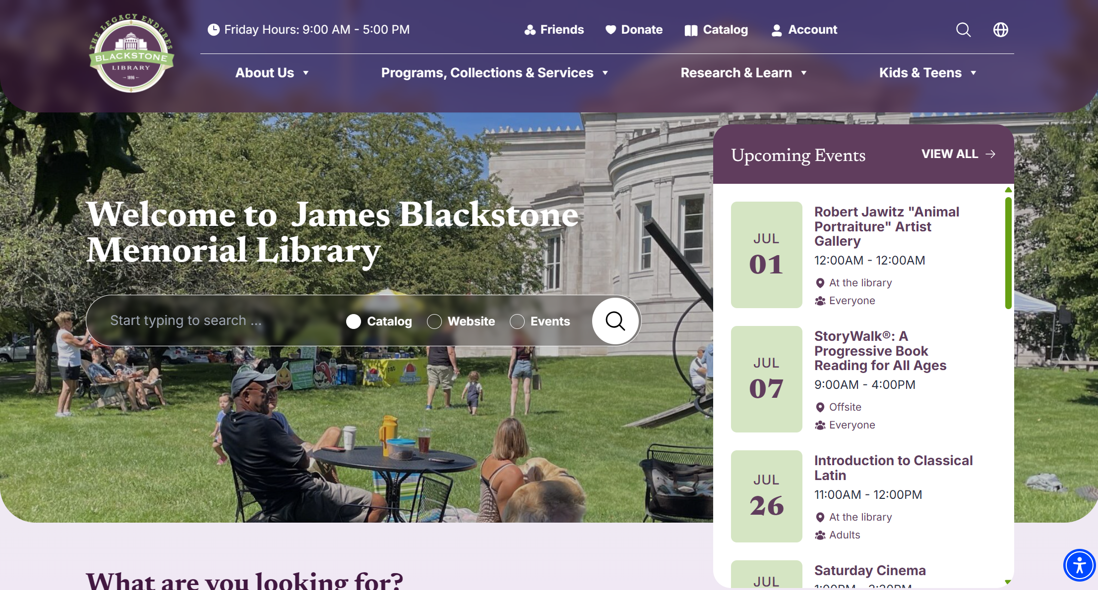
James Blackstone Memorial Library
Unique Features
Unique resources
Selectable tabs in featured modules
Design Strengths
Drop down menus
Upcoming events module
“What are you looking for?” section
Translator dropdown
Search bar options for catalog, site, or events
Design Weaknesses
Searching fills whole screen
Willoughby Wallace Memorial Library
Unique Features
Art gallery / exhibitions section
Design Strengths
Clean organization
Good use of images
Photo carousels
Design Weaknesses
Months old events left up, making page long
Event pics too large to view fully
Two menu bars


From this initial view of Hagaman’s website and similar pages, some ideas for improvement emerged:
Menu
“Library Services” tab is a long, alphabetical list; submenus and reorganization could make it easier to navigate
Boxes
Main page is a wall of boxes filled with text; this can be streamlined to be less crowded and more clear
Body Content
Many pages contain a large amount of text that can be cleaned up and trimmed; other material can be added to break up the words
Better use of visuals like images and icons
Site Search Bar
Add search capability to the website, not just the catalog
Typography
Better typeface choices, less capitalization for clearer hierarchy
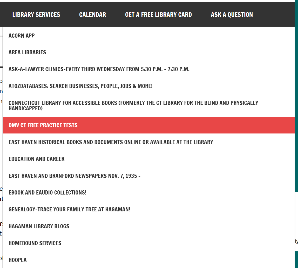
Top half of “Library Services” dropdown

Grid of boxes with capitalized text
Personas
Personas are fake characters created to represent a potential user of a product. Personas are formed from data gained in user research and help give a specific face to broad information.
Three personas were created for users of Hagaman Memorial Library. They represent different age groups of potential visitors who would have different goals on the website.

Persona 1: Lauren Miller

Persona 2: Mary Robinson

Persona 3: Jack Richards
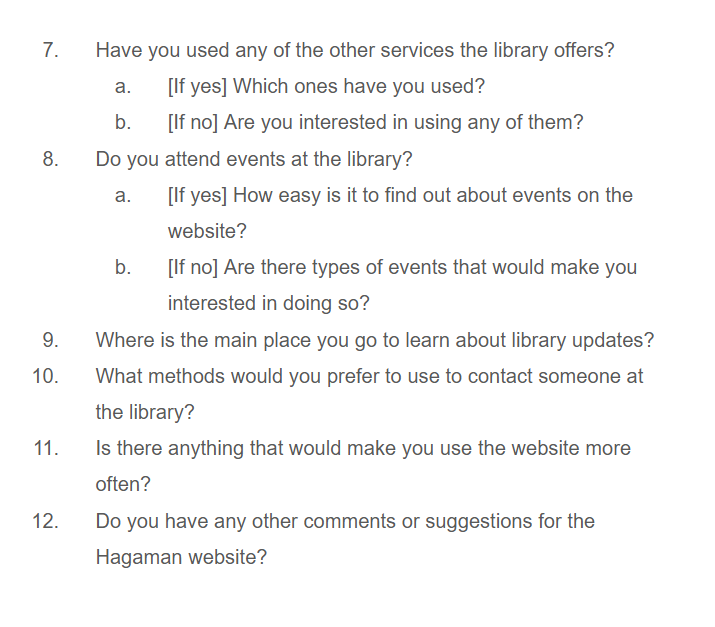
Proposed Interview
Interviews are a user research method for gathering information about specific users’ experiences with a product. The conversational format and open ended questions provide qualitative data that is more in-depth than simple multiple choice questions.
They are usually broken into 5 main stages: Introduction, Warm-up, Body, Cooling-off, and Wrap-up.
This interview contains a proposed interviewer script and subsequent research questions. The goals of this interview are to discover:
1. What information do users seek to find on the library’s web page?
2. What would make finding information easier?
3. What would improve the usability of the website?
5 Interview Stages
Introduction
Warm-up
Body
Cooling-off
Wrap-up
Introduction
Thank you for being here today. My name is Victoria and I am here on behalf of Hagaman Memorial Library. I appreciate you offering us your time and insight.
As a member of the community and user of the library, we would like to know how we can improve the Hagaman website to better suit your needs. With your permission, I would like to record the interview so I can revisit your comments later and put my full attention into our discussion.
I would like you to know that I am not a member of the development team. I am simply a neutral evaluator. Nothing you say will hurt my feelings, so please be honest with your answers. Being truthful will help us make the best decisions to help you and other users of the website. If you do not have an opinion or cannot answer any of the questions, feel free to say so.
Warm-up
To get started, I’d like to know a few things about you first.
1. Do you live in East Haven?
a. [If yes] How long have you lived in East Haven?
b. [If no] Where do you live? How long have you lived there?
2. How often do you visit the library?
a. What do you visit the library for?
Thanks for sharing with me. Now we can move on to talking
about the website.
Before we begin, I’d like to ask you to sign this consent agreement to ensure you understand how your information will be used.
If you have questions at any time, don’t hesitate to ask me. If at any moment you wish to end the session, you are free to leave.
Interview Body

Cooling-off
Thank you for sharing your thoughts. Before we wrap up, is there anything else you would like to add?
Wrap-up
Alright, I will turn off the recording now. Are there any questions you have for me? Thank you for taking the time to come and speak with me. You’ve been a great help.
Proposed Survey
Surveys are a research method mainly used to gather quantitative data about users. The multiple choice questions allow researchers to easily gather and analyze a large amount of information. There can be open-ended questions that provide qualitative data, but surveys are less focused on this than interviews. They also don’t require the time and space needed for one-on-one interactions. While interviews focus on in-depth information from a few people, surveys try to get a lot of general information from many people.
A survey was created using Google forms, though no responses were collected. The survey gathers demographic data about the users as well as quantitative data about their opinions of the website. There are 21 questions in total, a mix of multiple choice, multiple response, Likert scales, and open ended.
Survey Introduction and Questions


Proposed Diary Study
Diary studies are a longitudinal UX research method used to track information over a period of time. Rather than being in a research facility or interview room, diary studies seek to gather information in context of where they take place. Participants self-report experiences in “diary entries” for a length of time.
Entries can take many forms: handwritten paper, emails, text messages, and even voice or video recordings. The type is decided by what the researchers feel will best fit their users. The amount of diary entries depends on the reporting style:
Interval Based - Reporting at regular intervals
Event Based - Reporting when an event occurs
Signal Based - Reporting when prompted by a signal
Researchers will choose the method most suitable for what they are studying.
For the proposed Hagaman diary study, participants are asked to record an email diary entry each time they visit the website over a two month period.
What Question Does the Study Attempt to Answer?
The Hagaman Memorial Library is a local public library that provides access to books and other media but also serves as a venue for a variety of events and services.
This diary study attempts to answer “How easy is it to find information on the Hagaman Memorial Library website?”
It aims to learn for what reasons users access the website and what facilitates or hinders them finding what they are looking for.
“How easy is it to find information on the Hagaman Memorial Library website?”
Participants
At least 15 participants is the goal for this study. Hagaman Library is a local service that isn’t particularly large, so 15 is an appropriate number for gathering people of multiple age groups and backgrounds.
Participant Sample Type
Participants will be chosen through in-person recruitment at the library and through the library’s mailing list. A banner at the top of the website will recruit visitors online as well.
Incentive
Participants will be given a $5 Barnes and Noble gift card for each week they are in the study, totaling $40 by the end of the 2 months.
Diary Questions
Each diary entry consists of five simple questions:

Length of Study
The study will last for 2 months. A variety of users may use the site more or less frequently, so this period provides time for visits to naturally occur.
Data Analysis
The study will use an affinity diagram to analyze its qualitative data. Similar concepts and concerns in the emails will be grouped together so prominent insights can emerge.
Usability Inspection
Card Sorting
Card Sorting is a user research method that helps determine the architecture of a website. Participants are given “cards” of various topics, and they must group them into categories. By doing this, designers can see how users expect a site to be laid out and where they expect to find different types of information.
Three users sorted a variety of topics found on the Hagaman website. It was an open card sort, meaning there were no premade categories and the participants created their own. There were 31 cards in total, with some including a short description to clarify the meaning.
The study was conducted online through the website useberry.
Introduction
Hello. Thank you for taking the time to participate in this activity. My name is Victoria, and I am with the Hagaman Memorial Library in East Haven, Connecticut. The purpose of this study is to see how we can change the library’s website to improve usability and user experience.
You will be doing a card sort exercise shortly. In it, you will be given a set of cards and asked to sort them into groups that you label yourself. The activity should take about 15-30 minutes to complete, however, you are free to take as long as you need. You are allowed to leave at any point in the activity as well.
If you have questions at any time, feel free to ask them.
Wrap-up
Thank you for taking the time to participate in this study. Your feedback will be a great help in improving the Hagaman Memorial Library website. Do you have any questions for me?
Simple Summary of Results
First participant made 8 groups, second made 6, and third made 5
All three participants grouped these items (as seen on right):
Contact Us / Education and Career
East Haven Historical Books and Documents / DMV CT Free Practice Tests
East Haven and Branford Newspapers Nov. 7, 1935- / World War II Veteran's Discussion Group 2014-2019
Archive / ResearchIT CT Databases
Meeting Rooms / Calendar
Notary Service / Online Resources
Two participants labeled a group “Library”
Two participants had a similar group name: “Specific Historical Topics” and “Historical / Documentation”

Participant Instructions
Press the Get Started button to begin the activity. There are 31 cards in total. Each is labeled after a different topic found on the Hagaman website. Some have a short explanation if the name on its own might not be clear; hover/tap on the small (i) to view it.
Drag cards into the blank area to create a new group. Put cards that you feel are related into the same group. Give each category a name that you feel the cards belong under.
If there are cards you feel do not fit anywhere else, you may create a “miscellaneous” group for them.
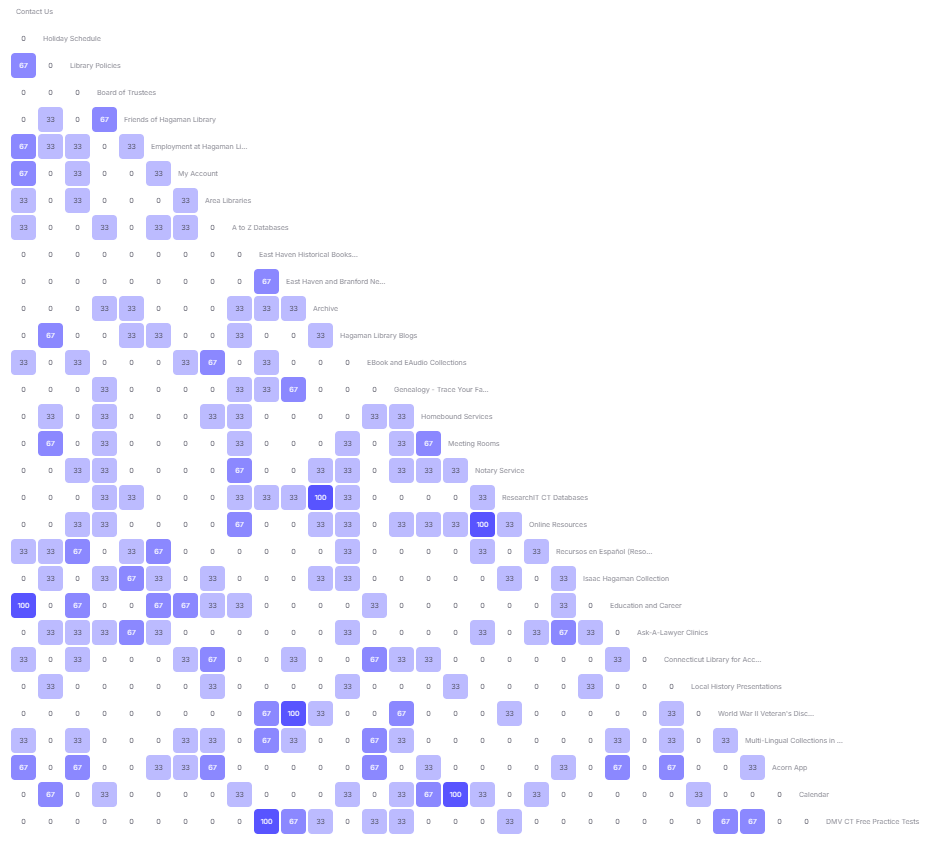
To view this chart in higher quality,
go to this link and select “Similarity Matrix”
Heuristic Evaluation
While the earlier research methods had feedback from users, a heuristic evaluation involves experts evaluating the site by a set of design criteria.
Jakob Nielsen and Rolf Molich created 10 Usability Heuristics in 1994 that are still used as guidelines for user friendly design.
The heuristics are:
Visibility of System Status - How informed users are of what the product is doing
Match Between the System and the Real World - How easy the product is to naturally understand
User Control and Freedom - Ability for users to stop / cancel / undo any taken action
Consistency and Standards - Keeping already known and understood aspects consistent
Error Prevention - Preventing user errors before they happen
Recognition Rather than Recall - Reducing users’ need to remember things by having information visible
Flexibility and Efficiency of Use - Providing shortcuts or personalization for experienced users
Aesthetic and Minimalist Design - Reducing irrelevant or distracting content or design
Help Users Recognize, Diagnose, and Recover from Errors - Providing clear error messages and helpful suggestions
Help and Documentation - Providing easy to access help
We used these guidelines to evaluate how well the current Hagaman website serves its users.


User Testing
Usability Testing
Usability testing involves seeing how well real users can perform actions and what pain points exist in the design.
Participants are given a series of tasks and are observed by a researcher. The user may also be timed on how quickly they are able to fulfill the task. Usability testing allows researchers to see how people interact on their own and hear their varying thought processes. These observations provide valuable insight into how users view the site and how it can be changed to better fit their mental models and expectations.
To read the full tasks and participant journeys, visit the final PDF found at the bottom of the page.
Introduction
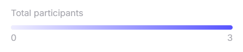
Participants

Task Completion Time Table
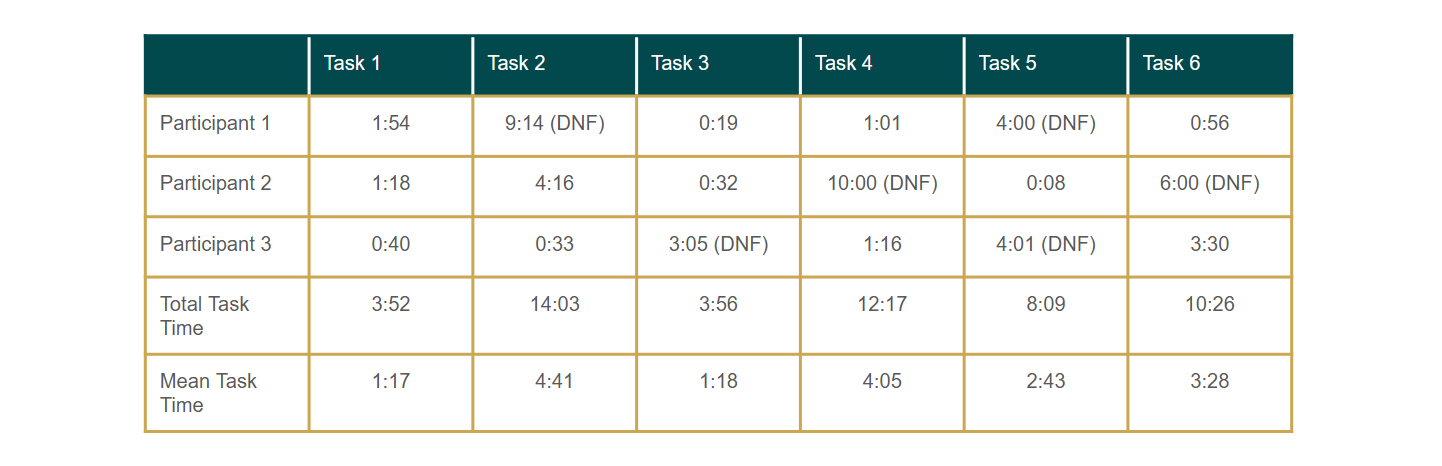
Time it took each participant to complete the tasks; Did Not Finish (DNF) marks when they couldn’t figure it out and were stopped
Post Test Question
Overall, what is your impression of the website?
Participant 1 thinks some places are confusing like the Holiday Calendar. She thinks it should be under Calendar with a little arrow since they both have to do with dates. With donate art / give art for presentation, she feels it should be in its own tab, not under Hoopla. “There’s some things that need to be fixed to give people a better time navigating. Rather than going through a maze just to find something completely different.”
Participant 2 said it could use some changes, like the Donate page being under a dropdown and the normal library schedule being under About Us between Contact Us and Holiday Schedule. Some things were easy to find, some others were hard to find. When asked “What made them hard to find?” Participant 2 stated, “I haven’t really gone to those pages so I didn’t really know where they were.” The researcher then inquired, “What do you think would made them easier to find?” Participant 2 said, “If they were more visible. Say this is someone’s first time on the website. It would make it easier for them to find if they were easily accessible, like under the dropdowns.”
Participant 3 stated that overall, it was good. He found a couple of tasks difficult to figure out, but would rate the site 75-80% positive.
Conclusion
Through this usability testing study, researchers were able to see where participants struggled on the Hagaman Memorial Library website and which tasks they had more trouble completing.
With this information, the researchers would recommend taking suggestions from the users as to what pages should be grouped together and where they should be located. Items related to dates and schedules should be in close proximity, for example.
Pages should be available in all parts of a location and not dependent on how you access the area; in particular, when clicking Library Services, there are a few pages not present in the dropdown list.
“There’s some things that need to be fixed […] Rather than going through a maze just to find something completely different”
Since it is important for the upkeep and function of the library, the Donate page should be more visible and accessible, either on the navigation bar itself or under a dropdown like About Us.
Links should be clear about what their content is. Users did not expect the Hoopla page to have what they were searching for.
In all, this usability test highlighted key areas for improvement on the Hagaman website. With changes, designers can ensure users will be able to navigate and find the information they want through clear and logical organization.
Final Recommendations
The analyses of tests and studies in this report have produced recommendations for improving the usability and design of the Hagaman Memorial Library website.
The recommendations are as follows:
Allow the search bar to search the site, not just the catalog
Move the Donate button to the end of the nav bar for visibility
Rethink pages with unclear names like Hoopla; consider moving the content to other areas instead
Reduce the amount of text on pages; use more visuals like images and icons
Group similar items; make the schedules viewable in the same area such as with Calendar
Move hard to find pages to clear menu locations
Reduce links in menu dropdown; group them into subcategories or remove them altogether
Update or remove outdated / inaccurate information
Give the newspaper archive filters for different years
Reorganize sidebar; remove link to chat service being used, and in general, put the most important or engaging features higher, eg. Search, Newest Books, Schedule, Mailing List
Create section for history based items
Text should be redesigned for better hierarchy with less bold and caps
Ensure consistency on every page
For a more in-depth version of this case study in one cohesive document, click the link below to view the final PDF.